Business card-less in Miami
So, I am officially out of business cards now. I mean really out. I mean really, really, truly out. Busted. Zip. Zilch. None. Ain’t got no mo’.
This comes, of course, at the perfect time: just when I have been laid off, and am attending networkers and social functions with renewed fervor. In truth, I am trying to get back to my early days in Miami, when I went to any and every event, met tons of great people and effortlessly made friends. Working my j-o-b and doing mind-numbing tasks for almost two years left very time and energy for me to get out to mix and mingle. Unsurprisingly (and yet, ironically) I had a superabundance of business cards (in fact, for most of the year, I had 2-3 different ones — 1 for my job, and 2 personal ones). But all good things must come to an end (like the job), and I have now completely run out of cards.
I must admit to a love-hate relationship with business cards. With those that I receive from other people, there is the question of 1) remembering (or even better, notating at the moment) who they are from and the context, and 2) figuring out how to keep them upon getting home. I hate clutter, but I also tend to save things in case I need them, so I end up trying to devise clever ways to save people’s biz cards in case I will need them later (I currently have them filed according to the event where I received them, which is working fairly well).
With my own business cards…(heavy sigh)…the issue is typically around designing them. Being a web person, I always have grandiose notions of having my website(s) and my business cards being in perfect sync with each other. But being a web person also means that I am prone to wanting to keep my site updated with the latest web design trends. Thankfully, these days, the focus is back on content and less on flashy/glittery/moving things (like it was in the early 2000’s). But redesigning a website takes a lot of time and work. Often, a much-needed new business card design gets lost in shuffle.
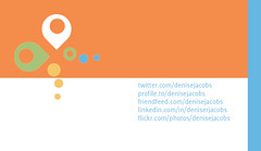
But today, necessity wins out. So, per another request, here are the newest designs for my business cards. I am also happy to say that I have done a front and back design.


14 Comments
Jess
December 19, 2008i love it!
vive la papillon!
c’est tres belle!
Denise
December 19, 2008Thank you ma’am, I am doing my best!
amberlinn
December 19, 2008So are you still keeping the “coming into focus” though? I that LOVe that one….and I see more cards than the business end of a cardscan, nawadimean.
This one is very cute too. Just wonderin 🙂
Denise
December 19, 2008Here’s the thing with “coming into focus” – isn’t there a point where the object has come into focus? In other words, “coming into focus” is a transitional state until you are in focus. My hope with that phrase was to indicate that I am on the verge of great things. I do actually want to get to the great things! So I am hoping to eventually replace “coming into focus” with something else that implies that I have, in fact, arrived.
caroline
December 19, 2008sweet! and eyecatching…kinda like the designer..heh.
Denise
December 19, 2008You’re such a sweetie! thank you. I really like them, (at least for now). Already thinking about the next design, though…
amberlinn
December 20, 2008True…as a friend I understand that. But, as a lost consumer, in need of consulting or direction I think that phrase applies to what you can do for *me*…not about what you are trying to do for yourself…maybe if it evolved into: “Denise Jacobs…Come Into Focus”…just thinking outloud…feel free to ignore me lol
Jtoddb
January 7, 2009Hey, Denise– new cards look great!
BTW, love this line “Working my j-o-b and doing mind-numbing tasks for almost two years”. Whatever do you mean? 🙂
Denise
January 7, 2009I’m glad you hear me, Todd. Some of that stuff was so wrong to do. I am not a PM, deep in my heart. Luckily, I don’t have to do that kind of work anymore. On to bigger’s and better’s!
John MacMenamin "Altered"
January 27, 2009Thanks for the comment on my blog I love your business card design.
Great colors.
-John
Denise
January 27, 2009Thanks John! Hopefully, the next design will warrant being in one of the future Top 100 hottest business cards post on your site. That would be quite an honor!
Sammy Hendrick
February 9, 2009Nice card! One small thing.. I don’t know if you planned it or not, but it would look cool if the design of the back were inversed, almost like the backside of something that was stitched. That way the back and the front have the logo, text and blue stripe on the same side.
“Working my j-o-b and doing mind-numbing tasks for almost two yearsâ€.
Still doing some mind numbing work, but at least I’m now getting paid more to do it! lol.
Denise
February 9, 2009Thanks Sammy! Actually, I did think of doing that, but only after I had uploaded the files and placed the order. That will have to be for the next business card design.
The nice thing about this card design is that it is very portable and reusable. I did a slideshow presentation last week, and I made the slideshow template to match my card, and I am really happy with it: http://www.slideshare.net/denisejacobs/how-to-get-your-website-into-the-21st-century.
I bet your next position is going to kick-ass: be really interesting and allow you to learn and grow, and be fantastically compensated for it as well.
zoe
February 9, 2009when you say “i have a love/hate relationship”…I completely understand.
sometimes there is that awkward feeling, almost like asking a stranger for their number. And then, as you point out, dealing with the mess of them afterwards.
That being said, there is something to be said about a nicely designed card such as yours. They do say a lot about a person. I once wrote a post about you could tell all about someone based on their business card…lol
z